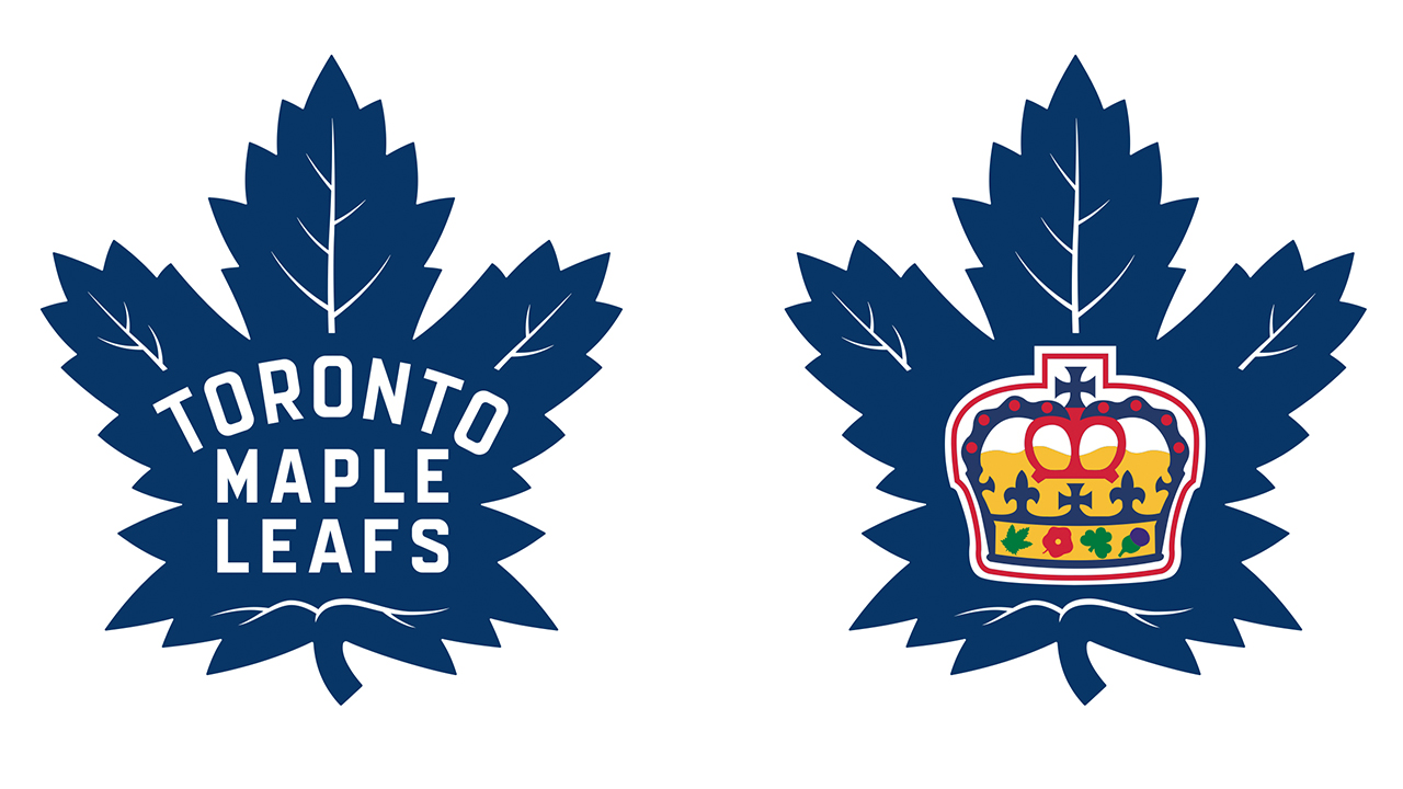
TORONTO (AP) -- The Toronto Maple Leafs have unveiled a new logo for the first time in more than 45 years in anticipation of their centennial season.
The new look was released by the team Tuesday night and is a fresh take on the ''classic Maple Leaf'' emblem of Toronto teams from the 1940s to the 1960s. It will serve as the team's primary crest beginning in the 2016-17 campaign.
The logo, with some slight alterations, aligns most closely to a version worn from 1963 to '67, the most successful era in Maple Leafs history. The team hasn't won the Stanley Cup since 1967.
It's the fifth adjustment to the logo since the team changed its name from the Toronto St. Patricks to the Toronto Maple Leafs in 1927, and the first change of any kind since 1970.
The new logo resembles a real leaf more closely than the current insignia, which has sharper lines and blocky letters.
Entertainment Plaza - TV, Movies, Sports, Music, Soaps
http://members.shaw.ca/almosthuman99
Babe Of The Month - Vote Now!
http://members.shaw.ca/almosthuman99/babeofthemonth.html
Hunk Of The Month - Vote Now!
http://members.shaw.ca/almosthuman99/babeofthemonthman.html
No comments:
Post a Comment